
A collection of thoughts by our resident artist Jessica Hiemstra & our Visual Merchandising Director Becky Hillis regarding their recent journey to Paris and Maison + Objet.What we feel like we saw in Paris was a kind of practical joy, a rebirth of the best of the 1970s from plaid to wild hair to rebellion to politics – that kind of exciting revolution of the 70s that’s so mythologized. Hope for the races, playfulness mixed with action. We just want to share with you the pulse of things…
Personality
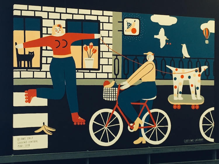
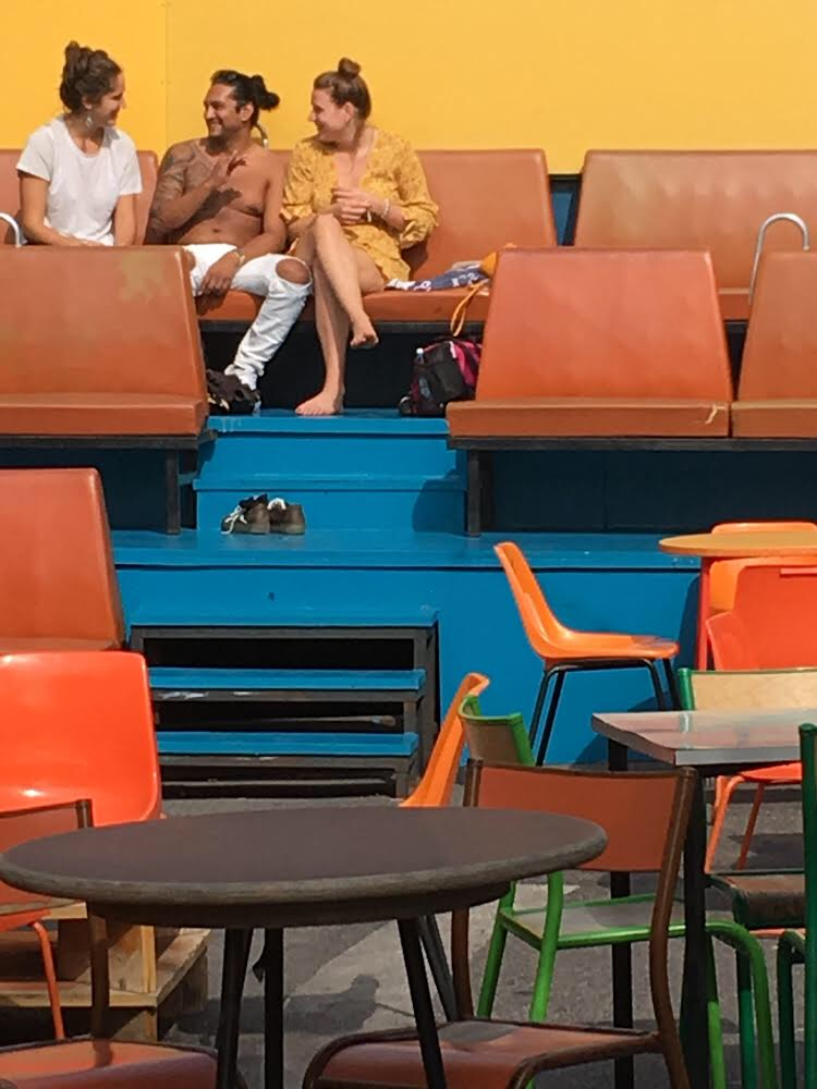
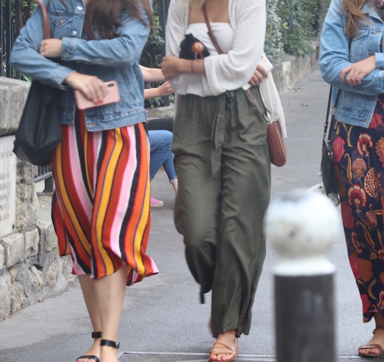
Paris felt colorful, cheeky and playful. But all that play felt very grounded.
Pattern
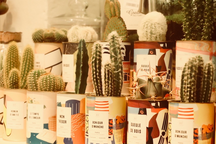
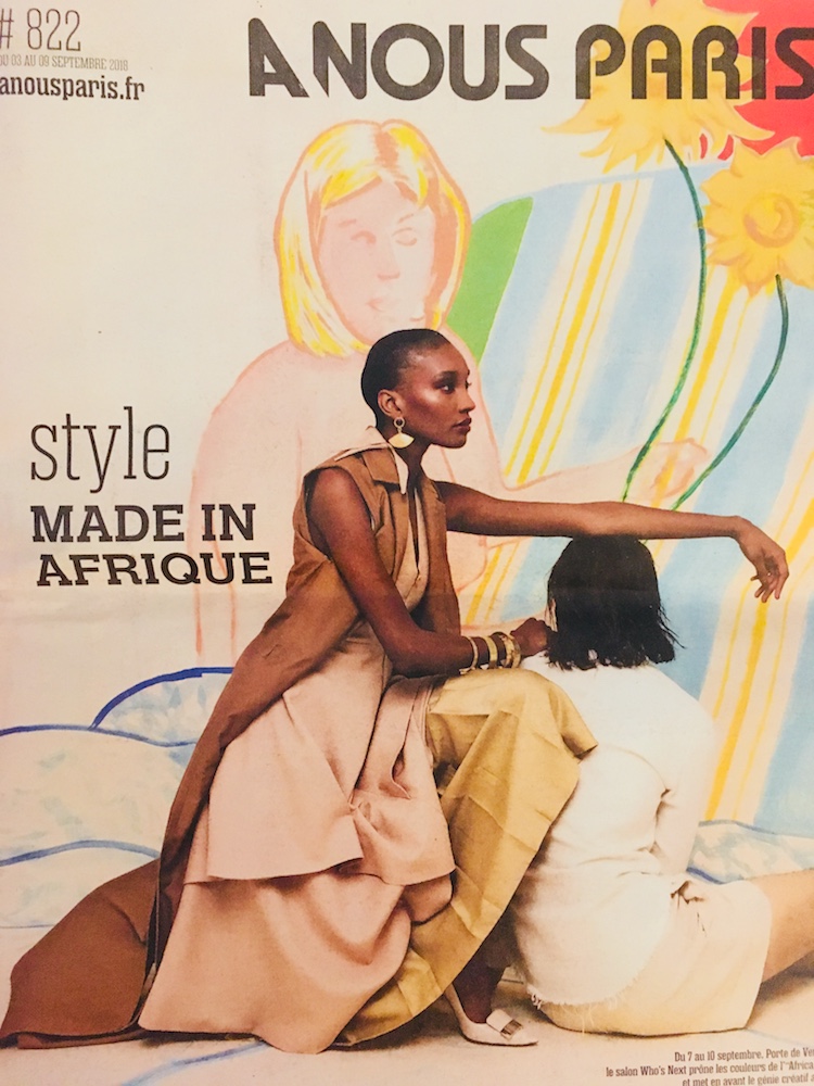
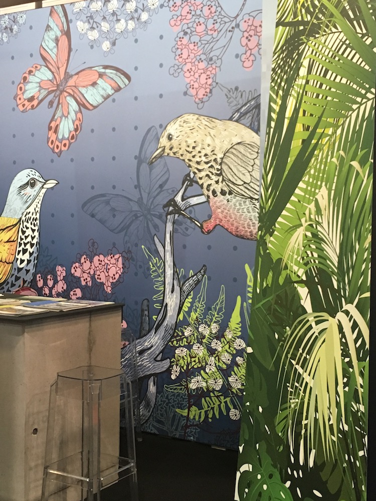
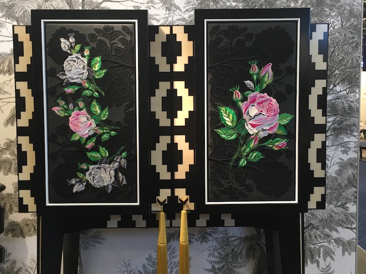
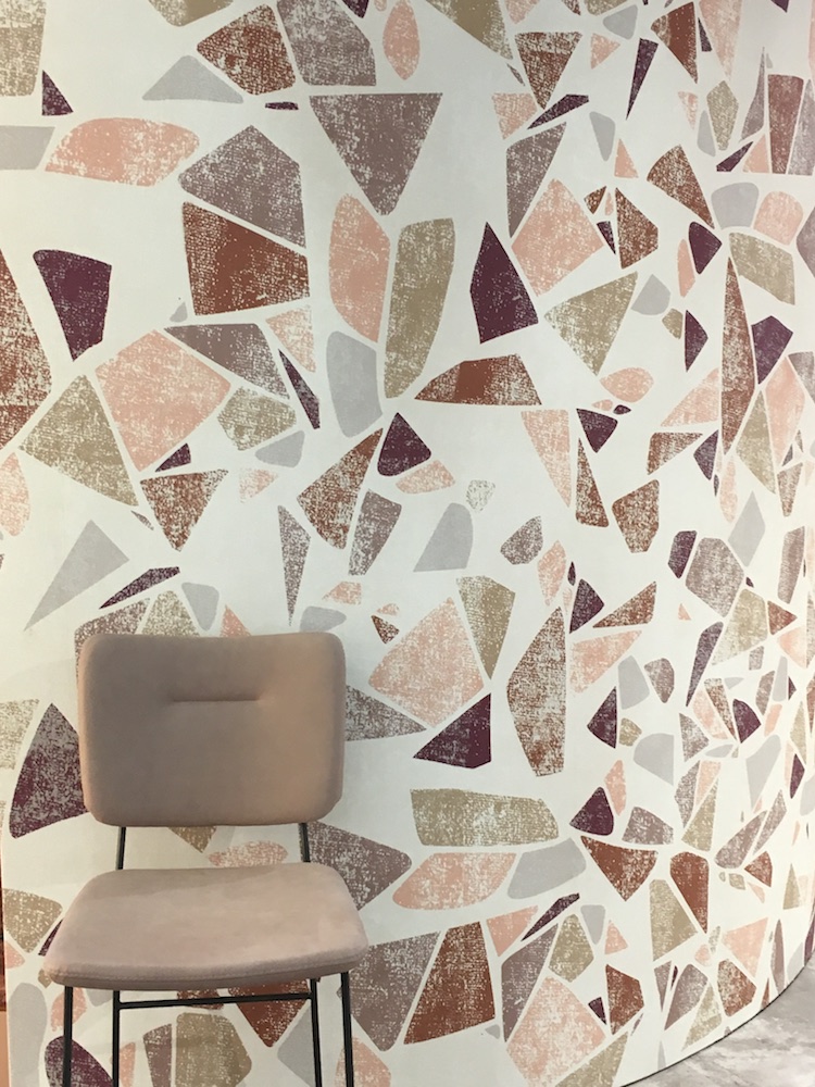
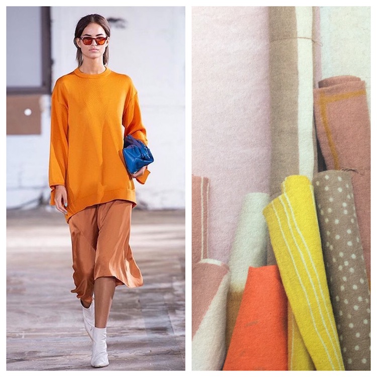
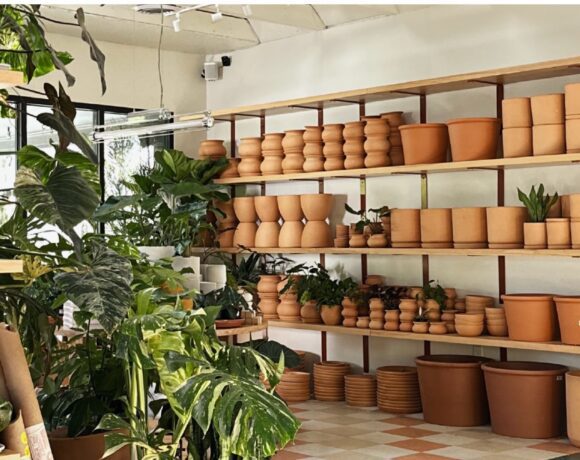
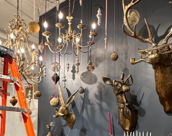
Polka dots, generous trench coats, hats, mustards, sepia, pink, paisley, and a raucous mix of all of it. Pattern and yellow are not for the faint of heart. On a large scale – there was pattern in shape. Large shapes on the floors, as backdrops, as parts of displays.
Everyone’s personal style seemed to reinforce what we were observing! From long trench coats to bright pink shoes, to floral prints everywhere. There was joy and abandon in people’s dress. But, as always, those Parisians were killing it with the classy.
Palette
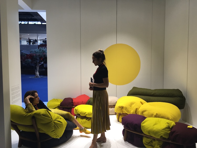
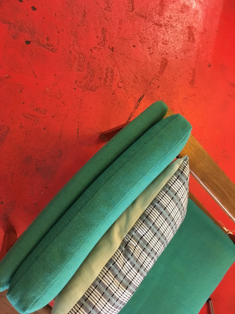
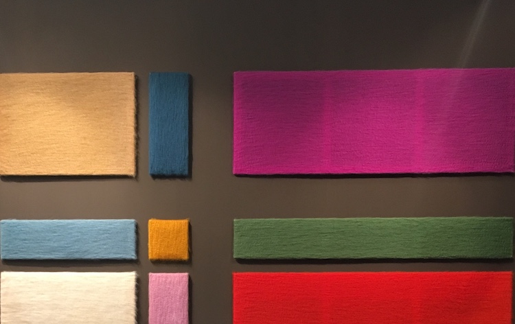
There were so many fun palettes at the show – from bold and cheerful, to that rich 70s sweater mix, to a touch of grey and warm browns (which we especially saw in the print literature). It’ hard to separate pattern and palette because many of the palettes were a strong set of colors with a bit of pattern (or a lot of it) tossed in. We saw so much Ochre, yellow, splashes of bright red, warm browns, a soft blue-green, purple. It was also interesting to see pastel neons! There were a number of lights that seemed to be all the rage that were opaque plastics and pastel neon colors. There were some interesting absences. Pink was there – but as moments to complement the other colors. It was sometimes coral, salmon, hot pink… present, but certainly no longer dominating. There was a bright cobalt blue complimenting the yellow often, and there were also many moments of sky blue holding things together. And sandy warm browns grounding it all. Print advertising also seemed to boldly play, imagine and challenge stereotypes, and it would appear that for the moment ochre is, dare we say it, the new pink…


COMMENTS ARE OFF THIS POST