
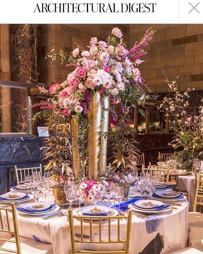
We chatted with Jared Hughes from Mathews Furniture + Design to find out more about the story behind his featured creation in Architectural Digest. Hughes, with assistance from fellow Interior Designer Nina Nash, felt greatly inspired and immediately drawn to the color gold and knew that blush and cobalt blue (which happens to be his favorite color) would lend themselves well to furthering the color palette. With those colors in mind the duo reached out to Kristen Giorgi of NG Collective to turn the table’s linens into artwork. Hughes requested that she paint the fabric as if it were one of her paintings, buying the same kind of linen she’s accustomed to brushing on, and working with Designs by Sudi to sew the tablecloth to make “canvas” for Kristen’s painting.
The tablecloth was merely the first layer. Hughes says he’s been obsessing over L’objet China for some time now and knew that they had a charger with a Greek key border and plaster in their collection that fulfilled his love for Chinoiserie. This charger set the stage for finding the rest of the china for the table,”We chose a simple gold band plate topped with an hand painted pottery plate curated in small collections for Anthropologie – the artisanal feel and cobalt paired well with Kristen’s table cloth. We chose a contemporary gold flatware with Vera Wang in addition to Sferra cobalt napkins from Gramercy Home, to continue with the mix of classic, artisan and contemporary elements.”
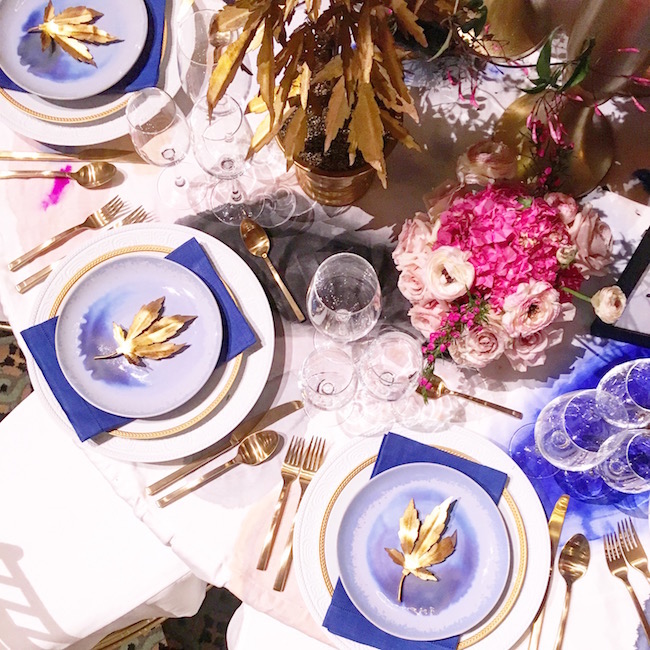
In regards to show space design, Hughes always tries to infuse something ‘a little weird or controversial’ to keep things interesting. “I had seen these gold cannabis plants from Tommy Mitchell and knew from the beginning I wanted those represented on the table. I then had Tommy make individual pot leaves to accompany each place setting for the guests to take home as a gift.”
As the former head floral designer for Bold American Events, his innate love for flowers took the drama of the centerpiece to another level. The morning of the event, Hughes and his team headed to Dutch Flower Line in Chelsea where they selected a variety of peonies, garden roses, astilbe, stock, jasmine, ranunculus and hydrangeas in various shades of pinks and blushes.
The show piece that best personified his overall vision was Accent Decor’s Milan vase to mirror the gold accents while creating dramatic height and volume for the focal point of the table. Our vase produced an illusion of flowers bursting out of them – conveying Hughes concept of a literal flower explosion! What a spectacular way to see our product among such an extraordinary array of elements!


COMMENTS ARE OFF THIS POST