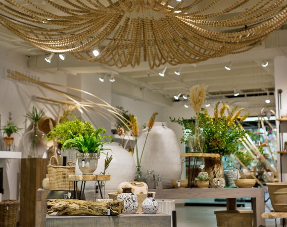
Color blocking doesn’t mean you have to arrange all your products in a rainbow row, but considering it for your shop or window display could help bring an organized, cohesive look to your merchandising.
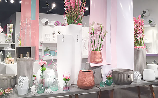
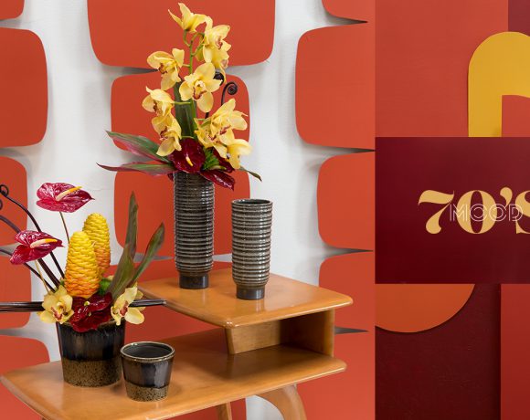
In our showroom, we had a section inspired by Jackie O. and color played a huge part in that story. While we used color blocking mainly in the environment around our products, we were also strategic in the products we chose to live there – sticking to metallics, neutrals, and glass to help the paint and florals pop.
Here’s a few tips you can use to bring color blocking to your own merchandising displays:
1. Know Your Color Wheel:
Paying attention to color harmony is a necessary step in the process. Here’s some popular starting points to keep in mind when choosing colors.Complementary – opposites on the color wheel. Great for making certain colors stand out
Triad – colors that are evenly spaced from each other on the color wheel
Analogous – colors that are next to each other on the color wheelNeed help picking the perfect palette? We love Adobe’s Color Wheel Tool.
2. Tell A Story:
Use autumn jewel tones to feature your new fall line or pick out muted neutrals if you’re showing off your eco friendly products. By pairing your products with specific colors, you’re inspiring your customers with a story and allowing them to visualize your products in an environment that appeals to them.
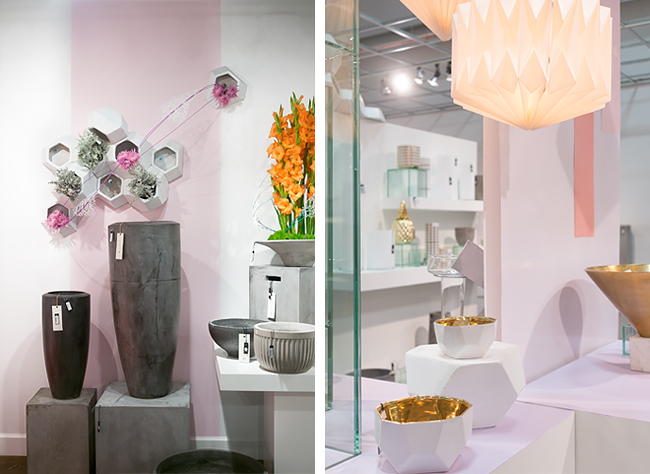
For our Jackie O. Story, we chose to focus a lot on white, clear, metallic, and pastel products that had strong lines and bold shapes, all features that were popular in the 1960s. Adding our cement pieces grounded the story and gave it an updated, industrial touch.
3. Use Your Products:
While we used color blocking mainly in the environment around our products, we also used our flux planters to help bring our Jackie O. story to life. With the geometric angles, stacking ability, and easy to drill material, the Flux Planter added visual interest not only to our walls, but to our tabletops, acting as product risers. By using an all white product in mass, we had a dimensional blank canvas to build upon.
4. Think about flow and direction
In order for the whole look to feel anchored, we designed our color flow to travel from bottom to top. So, the heaviest, darkest tones sat at the bottom, and then we added white to the paint to get lighter and lighter as we painted our display structures.
5. Take Risks
Sometimes, our best work comes when we break the rules a little bit. When adding strips of colored paper and pairing products together, we embraced symmetry rather than sticking to the hard-fast rule of thirds in product groupings or keeping everything asymmetrical.
What sort of risks have you taken in your merchandising that really paid off? Tell us in the comments below!

 3. Use Your Products:
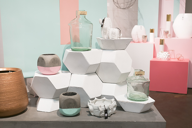


COMMENTS ARE OFF THIS POST